

ProgressBar
A ProgressBar is a visual element used to indicate the progress of an action or process.
Guidelines
When to use progress bars
Use a ProgressBar when you want to provide real-time feedback on the progress of ongoing operations, such as file uploads or form submissions.
If the progress of a task is not crucial to user understanding or if the task is expected to complete quickly, avoid using a ProgressBar.
Specifications
'%3e%3crect%20width='432'%20height='16'%20x='129.25'%20y='24'%20fill='%23fff'%20rx='8'/%3e%3cpath%20fill='%2336C'%20d='M249.65%2024h191.2v16h-191.2z'/%3e%3crect%20width='431'%20height='15'%20x='129.75'%20y='24.5'%20stroke='%23A2A9B1'%20rx='7.5'/%3e%3c/g%3e%3crect%20width='14'%20height='20'%20x='58.25'%20y='22'%20fill='%237458FF'%20rx='4'/%3e%3cpath%20fill='%23fff'%20d='M65.99%2028.11v6.69h-.84v-5.78l-1.58.96-.37-.6%202.05-1.27H66Zm1.44%206.2V35h-3.98v-.69z'/%3e%3cpath%20fill='%236D50FF'%20d='M241.25%2032.5h-169v-1h169z'/%3e%3cg%20opacity='.26'%20transform='matrix(1%200%200%20-1%20241.25%2040)'%3e%3ccircle%20cx='8'%20cy='8'%20r='8'%20fill='%23fff'/%3e%3ccircle%20cx='8'%20cy='8'%20r='8'%20fill='%236D50FF'%20fill-opacity='.8'/%3e%3c/g%3e%3ccircle%20cx='4'%20cy='4'%20r='4'%20fill='%236D50FF'%20fill-opacity='.9'%20transform='matrix(1%200%200%20-1%20245.25%2036)'/%3e%3cpath%20fill='%236D50FF'%20d='M568.25%2032.5h50v-1h-50z'/%3e%3cg%20opacity='.26'%20transform='rotate(-180%20560.25%2032)'%3e%3ccircle%20cx='560.25'%20cy='32'%20r='8'%20fill='%23fff'/%3e%3ccircle%20cx='560.25'%20cy='32'%20r='8'%20fill='%236D50FF'%20fill-opacity='.8'/%3e%3c/g%3e%3ccircle%20cx='560.25'%20cy='32'%20r='4'%20fill='%236D50FF'%20fill-opacity='.9'%20transform='rotate(-180%20560.25%2032)'/%3e%3crect%20width='14'%20height='20'%20x='618.25'%20y='22'%20fill='%237458FF'%20rx='4'/%3e%3cpath%20fill='%23fff'%20d='M624.95%2028q.65%200%201.1.25.48.25.72.69.25.44.25.98%200%20.48-.16.93a4%204%200%200%201-.53.95q-.36.5-.95%201.1-.6.6-1.44%201.38h3.24l-.1.72h-4.1v-.69a53%2053%200%200%200%202.23-2.28q.36-.42.56-.77a2.5%202.5%200%200%200%20.37-1.3q0-.6-.33-.92a1.2%201.2%200%200%200-.9-.33q-.51%200-.84.17a2%202%200%200%200-.65.56l-.58-.45a3%203%200%200%201%20.91-.74%203%203%200%200%201%201.2-.24Z'/%3e%3cdefs%3e%3cfilter%20id='a'%20width='434'%20height='18'%20x='128.25'%20y='24'%20color-interpolation-filters='sRGB'%20filterUnits='userSpaceOnUse'%3e%3cfeFlood%20flood-opacity='0'%20result='BackgroundImageFix'/%3e%3cfeColorMatrix%20in='SourceAlpha'%20result='hardAlpha'%20values='0%200%200%200%200%200%200%200%200%200%200%200%200%200%200%200%200%200%20127%200'/%3e%3cfeOffset%20dy='1'/%3e%3cfeGaussianBlur%20stdDeviation='.5'/%3e%3cfeColorMatrix%20values='0%200%200%200%200%200%200%200%200%200%200%200%200%200%200%200%200%200%200.2%200'/%3e%3cfeBlend%20in2='BackgroundImageFix'%20result='effect1_dropShadow_827_64480'/%3e%3cfeBlend%20in='SourceGraphic'%20in2='effect1_dropShadow_827_64480'%20result='shape'/%3e%3c/filter%3e%3c/defs%3e%3c/svg%3e)
Progress bars include the following elements:
- Progress bar
Visual representation of the progress displayed as a filled blue bar. - Bar container
White container that holds the progress bar.
Types
There are different types of progress bars, depending on your intended use.
Default progress bar
Elevated progress bar to indicate that the ongoing system process will affect an entire view or page area.
'%3e%3cg%20clip-path='url(%23b)'%3e%3cpath%20fill='%23fff'%20d='M95%2011.68h500v262H95z'/%3e%3crect%20width='10.808'%20height='10.808'%20x='498.447'%20y='34.877'%20fill='%23EAECF0'%20rx='1.351'/%3e%3crect%20width='10.808'%20height='10.808'%20x='514.658'%20y='34.877'%20fill='%23EAECF0'%20rx='1.351'/%3e%3crect%20width='10.808'%20height='10.808'%20x='530.871'%20y='34.877'%20fill='%23EAECF0'%20rx='1.351'/%3e%3crect%20width='10.808'%20height='10.808'%20x='547.082'%20y='34.877'%20fill='%23EAECF0'%20rx='1.351'/%3e%3crect%20width='10.808'%20height='10.808'%20x='132.336'%20y='34.876'%20fill='%23EAECF0'%20rx='1.351'/%3e%3crect%20width='18.515'%20height='18.515'%20x='151.529'%20y='31.023'%20fill='%23EAECF0'%20rx='1.351'/%3e%3crect%20width='54.039'%20height='10.808'%20x='174.766'%20y='34.876'%20fill='%23EAECF0'%20rx='1.351'/%3e%3crect%20width='185.877'%20height='10.808'%20x='252.176'%20y='34.877'%20fill='%23EAECF0'%20rx='1.351'/%3e%3crect%20width='258.322'%20height='12'%20x='213.439'%20y='64.456'%20fill='%23EAECF0'%20rx='1.449'/%3e%3crect%20width='258.322'%20height='12'%20x='213.439'%20y='81.676'%20fill='%23EAECF0'%20rx='1.449'/%3e%3crect%20width='143.318'%20height='8.696'%20x='213.955'%20y='105.595'%20fill='%23EAECF0'%20rx='1.449'/%3e%3crect%20width='143.318'%20height='8.696'%20x='213.955'%20y='117.913'%20fill='%23EAECF0'%20rx='1.449'/%3e%3crect%20width='143.318'%20height='8.696'%20x='213.955'%20y='130.232'%20fill='%23EAECF0'%20rx='1.449'/%3e%3crect%20width='143.318'%20height='8.696'%20x='213.955'%20y='142.551'%20fill='%23EAECF0'%20rx='1.449'/%3e%3crect%20width='143.318'%20height='8.696'%20x='213.955'%20y='154.87'%20fill='%23EAECF0'%20rx='1.449'/%3e%3crect%20width='143.318'%20height='8.696'%20x='213.955'%20y='167.188'%20fill='%23EAECF0'%20rx='1.449'/%3e%3crect%20width='143.318'%20height='8.696'%20x='213.955'%20y='179.508'%20fill='%23EAECF0'%20rx='1.449'/%3e%3crect%20width='143.318'%20height='8.696'%20x='213.955'%20y='191.826'%20fill='%23EAECF0'%20rx='1.449'/%3e%3crect%20width='143.318'%20height='8.696'%20x='213.955'%20y='204.146'%20fill='%23EAECF0'%20rx='1.449'/%3e%3crect%20width='143.318'%20height='8.696'%20x='213.955'%20y='216.464'%20fill='%23EAECF0'%20rx='1.449'/%3e%3crect%20width='143.318'%20height='8.696'%20x='213.955'%20y='228.783'%20fill='%23EAECF0'%20rx='1.449'/%3e%3crect%20width='143.318'%20height='8.696'%20x='213.955'%20y='241.102'%20fill='%23EAECF0'%20rx='1.449'/%3e%3crect%20width='143.318'%20height='8.696'%20x='213.955'%20y='253.421'%20fill='%23EAECF0'%20rx='1.449'/%3e%3crect%20width='143.318'%20height='8.696'%20x='213.955'%20y='265.739'%20fill='%23EAECF0'%20rx='1.449'/%3e%3cpath%20fill='%23EAECF0'%20d='M364.52%20105.6h107.4v168.84h-107.4z'/%3e%3c/g%3e%3cpath%20fill='%23fff'%20fill-opacity='.65'%20d='M117.5%2024h493.27v274.25H117.5z'/%3e%3cg%20filter='url(%23d)'%3e%3cg%20clip-path='url(%23c)'%3e%3crect%20width='304.814'%20height='7.828'%20x='192.594'%20y='144.086'%20fill='%23fff'%20rx='3.914'/%3e%3cpath%20fill='%2336C'%20d='M298.23%20144.09h93.54v7.82h-93.54z'/%3e%3c/g%3e%3crect%20width='304.324'%20height='7.339'%20x='192.838'%20y='144.331'%20stroke='%23A2A9B1'%20stroke-width='.489'%20rx='3.67'/%3e%3c/g%3e%3c/g%3e%3cpath%20stroke='%23C8CCD1'%20stroke-width='1.409'%20d='M117.3%2023.3h455.4v249.4H117.3z'/%3e%3cdefs%3e%3cclipPath%20id='a'%3e%3cpath%20fill='%23fff'%20d='M118%2024h454v248H118z'/%3e%3c/clipPath%3e%3cclipPath%20id='b'%3e%3cpath%20fill='%23fff'%20d='M95%2024h500v248H95z'/%3e%3c/clipPath%3e%3cclipPath%20id='c'%3e%3crect%20width='304.814'%20height='7.828'%20x='192.594'%20y='144.086'%20fill='%23fff'%20rx='3.914'/%3e%3c/clipPath%3e%3cfilter%20id='d'%20width='305.793'%20height='8.807'%20x='192.104'%20y='144.086'%20color-interpolation-filters='sRGB'%20filterUnits='userSpaceOnUse'%3e%3cfeFlood%20flood-opacity='0'%20result='BackgroundImageFix'/%3e%3cfeColorMatrix%20in='SourceAlpha'%20result='hardAlpha'%20values='0%200%200%200%200%200%200%200%200%200%200%200%200%200%200%200%200%200%20127%200'/%3e%3cfeOffset%20dy='.489'/%3e%3cfeGaussianBlur%20stdDeviation='.245'/%3e%3cfeColorMatrix%20values='0%200%200%200%200%200%200%200%200%200%200%200%200%200%200%200%200%200%200.2%200'/%3e%3cfeBlend%20in2='BackgroundImageFix'%20result='effect1_dropShadow_1503_32987'/%3e%3cfeBlend%20in='SourceGraphic'%20in2='effect1_dropShadow_1503_32987'%20result='shape'/%3e%3c/filter%3e%3c/defs%3e%3c/svg%3e)
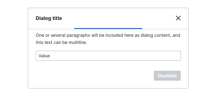
Inline progress bar
An inline and smaller version of the progress bar is available to indicate progress within other components, such as Menu or Dialog.
Interaction states
Indeterminate progress bars are always in motion and cannot be in an empty, completed, or disabled state.
'%20filter='url(%23b)'%3e%3crect%20width='182'%20height='16'%20x='254.25'%20y='50'%20fill='%23fff'%20rx='8'/%3e%3cpath%20fill='%2336C'%20d='M305.25%2050h80v16h-80z'/%3e%3crect%20width='181'%20height='15'%20x='254.75'%20y='50.5'%20stroke='%23A2A9B1'%20rx='7.5'/%3e%3c/g%3e%3cdefs%3e%3cclipPath%20id='a'%3e%3cpath%20fill='%23fff'%20d='M230.25%2050h230v16h-230z'/%3e%3c/clipPath%3e%3cfilter%20id='b'%20width='184'%20height='18'%20x='253.25'%20y='50'%20color-interpolation-filters='sRGB'%20filterUnits='userSpaceOnUse'%3e%3cfeFlood%20flood-opacity='0'%20result='BackgroundImageFix'/%3e%3cfeColorMatrix%20in='SourceAlpha'%20result='hardAlpha'%20values='0%200%200%200%200%200%200%200%200%200%200%200%200%200%200%200%200%200%20127%200'/%3e%3cfeOffset%20dy='1'/%3e%3cfeGaussianBlur%20stdDeviation='.5'/%3e%3cfeColorMatrix%20values='0%200%200%200%200%200%200%200%200%200%200%200%200%200%200%200%200%200%200.2%200'/%3e%3cfeBlend%20in2='BackgroundImageFix'%20result='effect1_dropShadow_827_67551'/%3e%3cfeBlend%20in='SourceGraphic'%20in2='effect1_dropShadow_827_67551'%20result='shape'/%3e%3c/filter%3e%3c/defs%3e%3c/svg%3e)
Demos
Configurable
| Name | Value |
|---|---|
| Props | |
inline | |
aria-label | |
disabled | |
| View | |
Reading direction | |
Default
Default indeterminate progress bar.
WARNING
Due to the lack of descriptive text, default progress bars require one of the following attributes: aria-label or aria-hidden.
The attribute aria-label has to be used on progress bars to be understandable by assistive technology users. Exceptions are inline progress bars in component combinations, e.g. in the Menu component, that are skipped by adding aria-hidden.
Inline
An inline version is available for use within other components. See Menu for sample usage.
Vue usage
Props
| Prop name | Description | Type | Default |
|---|---|---|---|
inline | Whether this is the smaller, inline variant. | boolean | false |
disabled | Whether the progress bar is disabled. | boolean | false |
CSS-only version
Markup structure
Inline
For an inline progress bar, add the cdx-progress-bar--inline class to the root <div>.
Disabled
For a disabled progress bar, add the cdx-progress-bar--disabled class to the root <div>.